Located in Adelaide City’s eclectic west end on a narrow site, a contemporary two level design approach complimented the mixture of uses, building forms and materials in the immediate streetscape including local heritage cottages, a contemporary residence, garages and a warehouse.
We made two key design moves with this project. Our first move was to remake the conventional developer-driven townhouse façade into a unique and individual public sculptural statement with a camouflaged entrance. The second move was to unpack the conventional cellular interior and promote the open plan, creating a large central atrium filled with natural light from a retractable roof and surrounding it with an array of veiled layered living spaces perched above and to either side.
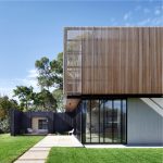
Council was cautious at first but worked closely with us to explore and develop the sculptural façade and camouflaged entry concept. The result is a high quality, contemporary, assertive and secure-looking facade with a tilting operable wall at ground level and a dynamic cantilevered form perched over the entry.
Operable hatches and vertical louvres in the façade give the building personality throughout the day and night and act as an adjustable filter between the public and private realm.
Plentiful daylight, natural ventilation and thermal mass in concrete floors and walls moderate room temperature fluctuations and reduce reliance on artificial lighting and air conditioning and reduce power consumption.
Much of the West End Residence’s personality can be traced back to its simple and timeless warehouse / industrial aesthetic and material palette comprising refined raw steel detailing combined with concrete, timber, and glass. A thin-plate steel stair minimises visual obstruction through the ground floor promoting a sense of openness and transparency. A cantilevered steel landing step adds a sense of drama and visual interest. Structural glazing panels and solid bar handrails create subtle visual layers within the space and steel details are carefully refined to express absolute simplicity and function.
A perforated structural steel bridge connects the front and rear living spaces at the upper level, detailed to promote a sense of quality, expansiveness, capacity and visual relief. Timber battens throughout the exterior and interior reveal a softer side to the building, a simple and timeless warehouse/industrial aesthetic and material palette comprising concrete, timber, refined steel detailing and glass, creating a sense of quality, expansiveness, capacity and visual relief.
This project explores design strategies capable of preserving the suburban ideals of space, light, texture, materiality, openness, authenticity and connection to nature, without perpetuating prevailing cultural preferences for bigger houses, darker lower quality interiors, and escalating energy costs.
2016 John S Chappel Award for Residential Architecture – Houses (New). Australian Institute of Architects.
Location: Adelaide, South Australia
Client: Withheld
Project Value: Withheld
Construction: Completed January 2016
Services Provided: Architecture and Interior Design


